This forum is dedicated to connecting hosts with other hosts. Sign up to get the latest updates and news just for AirBnb hosts! Note that we are not affiliated with Airbnb - we are just passionate hosts!
I did a search but results were too general.
Does anyone want to post a pic of some of their art decisions for their listings?
Do you spend time or money on decor or art? Or do you display your own? Does your listing have a theme?
I am needing to cover A 12 by 30 inch area and I am pretty sure I am creative enough to manage but I dont feel I’m objective as to what is too abstract or uncomfortable or out there for most guests… And if it is, should I even care?
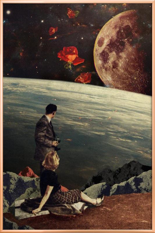
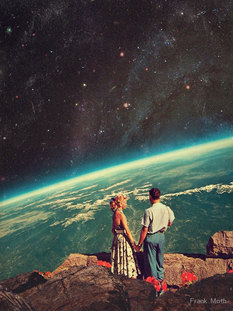
I am thinking about blowing up some black and white photography (a little ho hum but neutral) or getting a poster sized surrealist print done (cool but probably not for everyone). How about a big graphic pop art piece? Also pretty boring but neat esthetically. Too much for the over 60s set? Though that only constitutes 15%.
This would be for over the queen bed in the master bedroom.
Edited to add: the general flavour of my listing (which is humble compared to many of yours) is retro…60s atomic modern…Like mad men went camping. BUT the bedroom is more calm neutrals with purple/green/gold accents and a beautifully refinished solid teak desk, nature silhouettes (birds/trees). Black and white damask bedding. I would link to it but I haven’t updated the pics recently. I know! It is on my list this week.
I’m indecisive at times, obviously. Your help is appreciated.
Love 60s. Do you know the small English designers Mini Moderns?? I have their Paisley Crescent wallpaper in Tangerine in my bathroom - tiny bikes, houses buses and other aspects of suburban life woven into the paisley swirls.
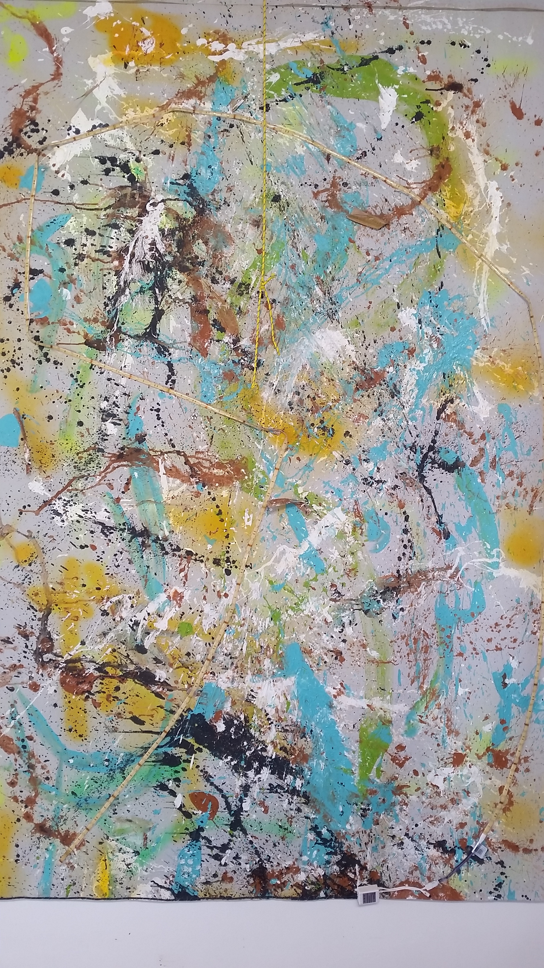
I have some Banksy canvases because he is associated with my city and I like the humour. I also have some city scapes e.g. Amsterdam which are printed onto old book pages. I guess the theme there is travel. Then I have an abstract firework canvas above the bed which to me is sexy (even though they’re single rooms lol).
I have heard of Mini Moderns but haven’t seen them! I will go off to suss it out. Guests seem to always mention that the place is so unique and stylish but to be honest, I find the sitting area a little clinical or cold. I try to view it as I have just checked in. Lol.
It’s all a work in progress! I think I have just been surrounded by Bakelite, stardust step tables and more kitsch than you can shake a stick at to have any taste left.
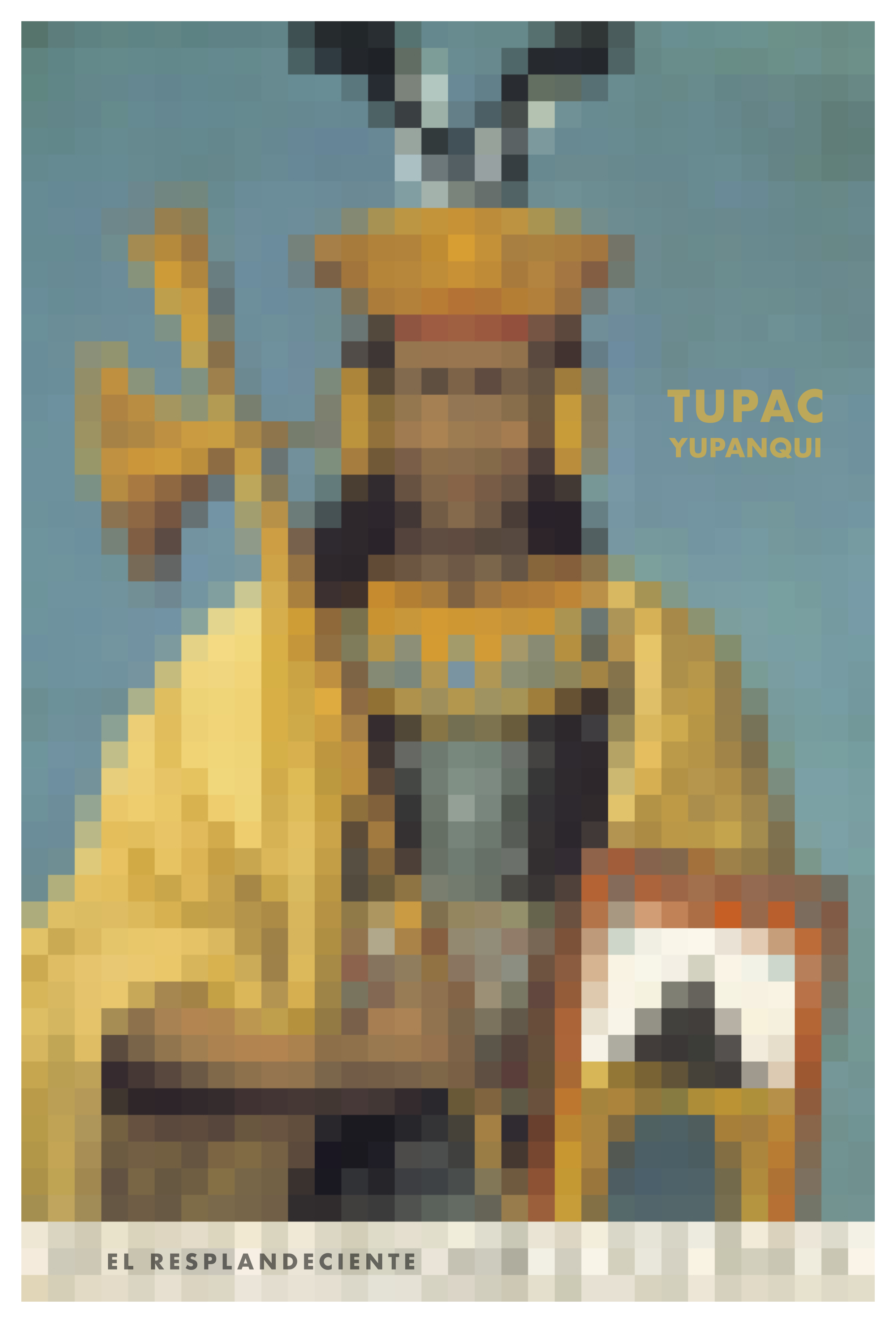
Each of our rooms is named after an Inca ruler, and each room has said ruler in an artwork in the room.
The black and white photo I bought on the internet. To give it an edge I put a colored rectangle on top (mint green) and at the bottom (reddish orange), with the same paint that is on the walls.
The two others are graphic designs I made myself. We got them printed on photo paper. I invested some time, but apart from that the overall cost was limited. I’m not pretending it’s big art, but it gets the job done. The most expensive were the tin white frames, that maybe cost USD 50,00 for the 3 combined.
Of course all three artworks are color coordinated with each room .
TIP: The pixelling (Tupac Yupanqui) you can do for free on the internet, with any low quality picture you can find. It’s really easy.
(Sorry, couldn’t find a photo of the artwork itself.)
I like the thought you put in. Cohesive and they are certainly statement pieces. I tend that direction too. These are what I was thinking in poster format.
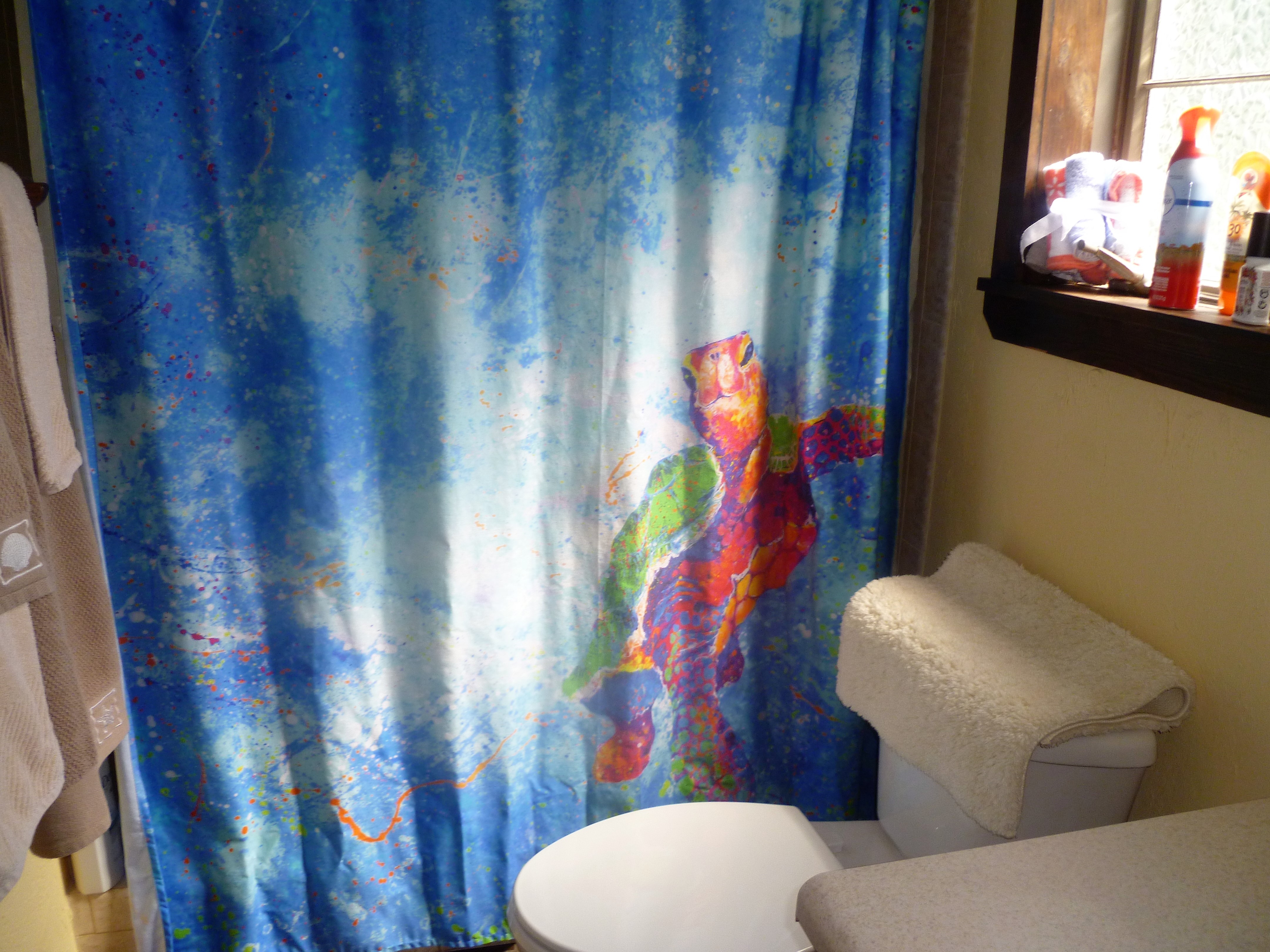
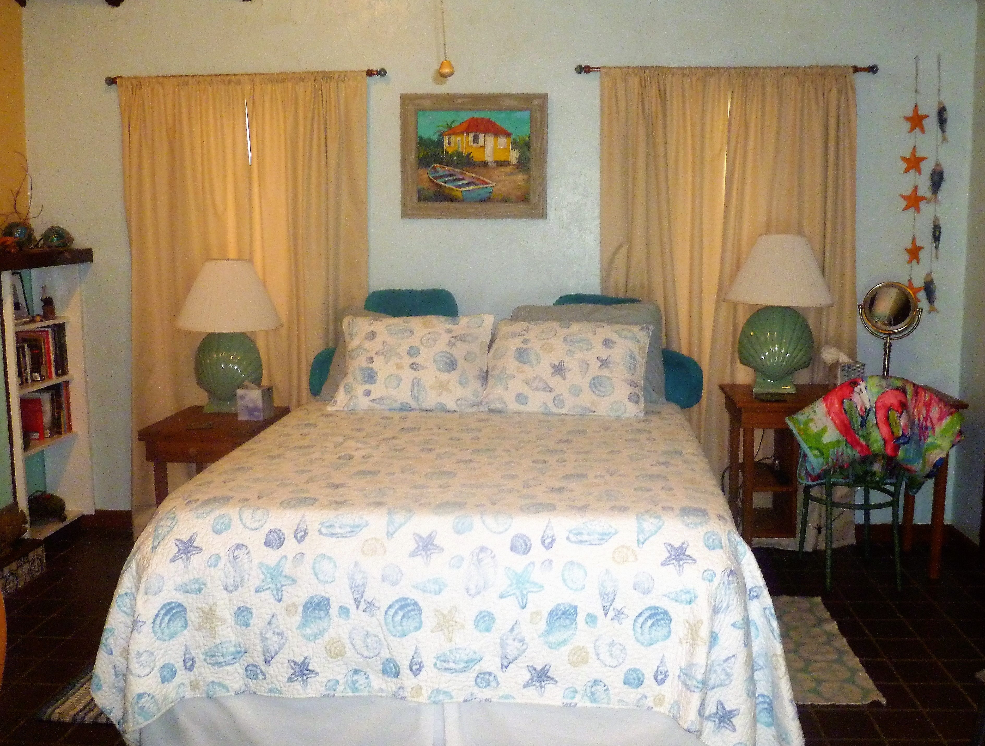
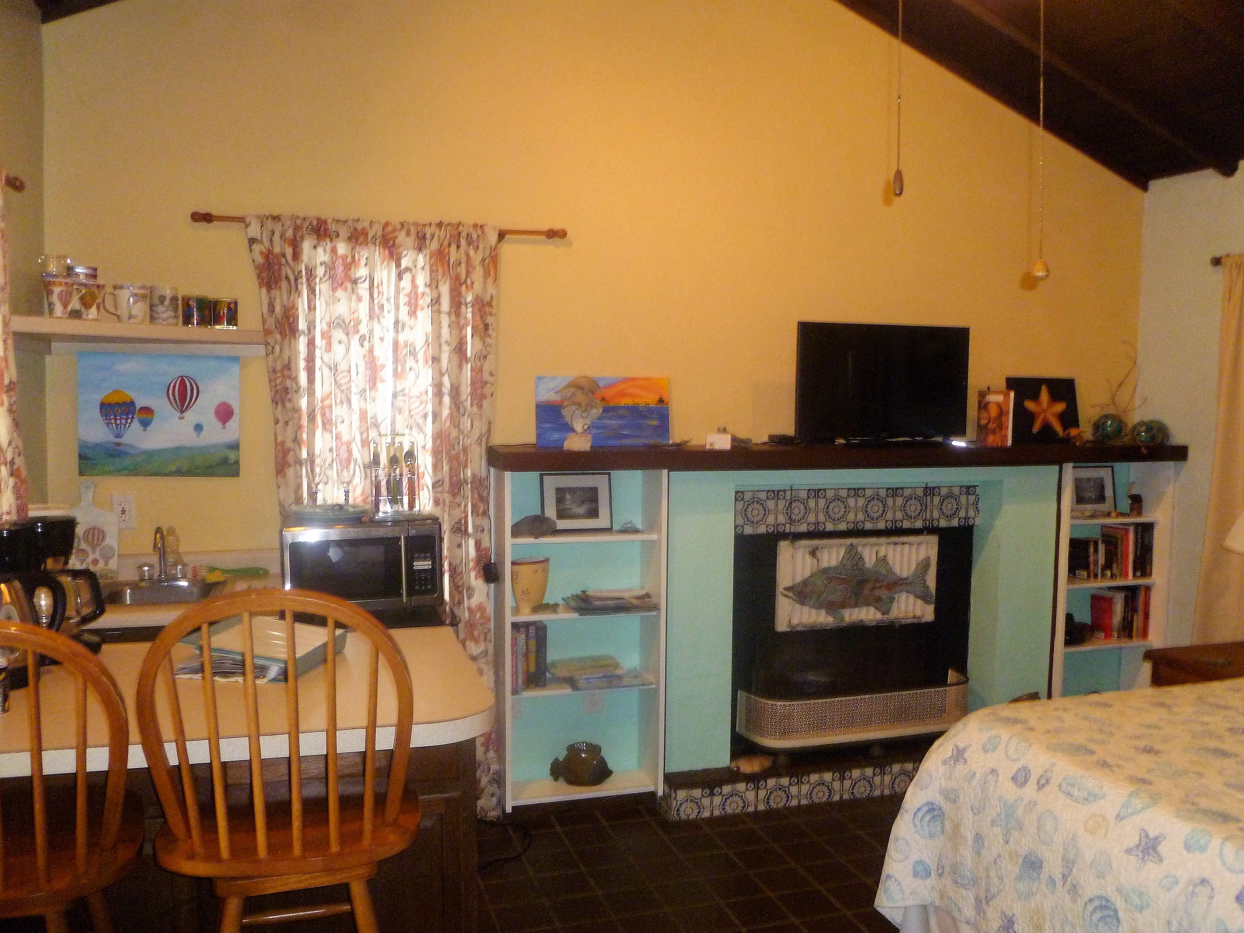
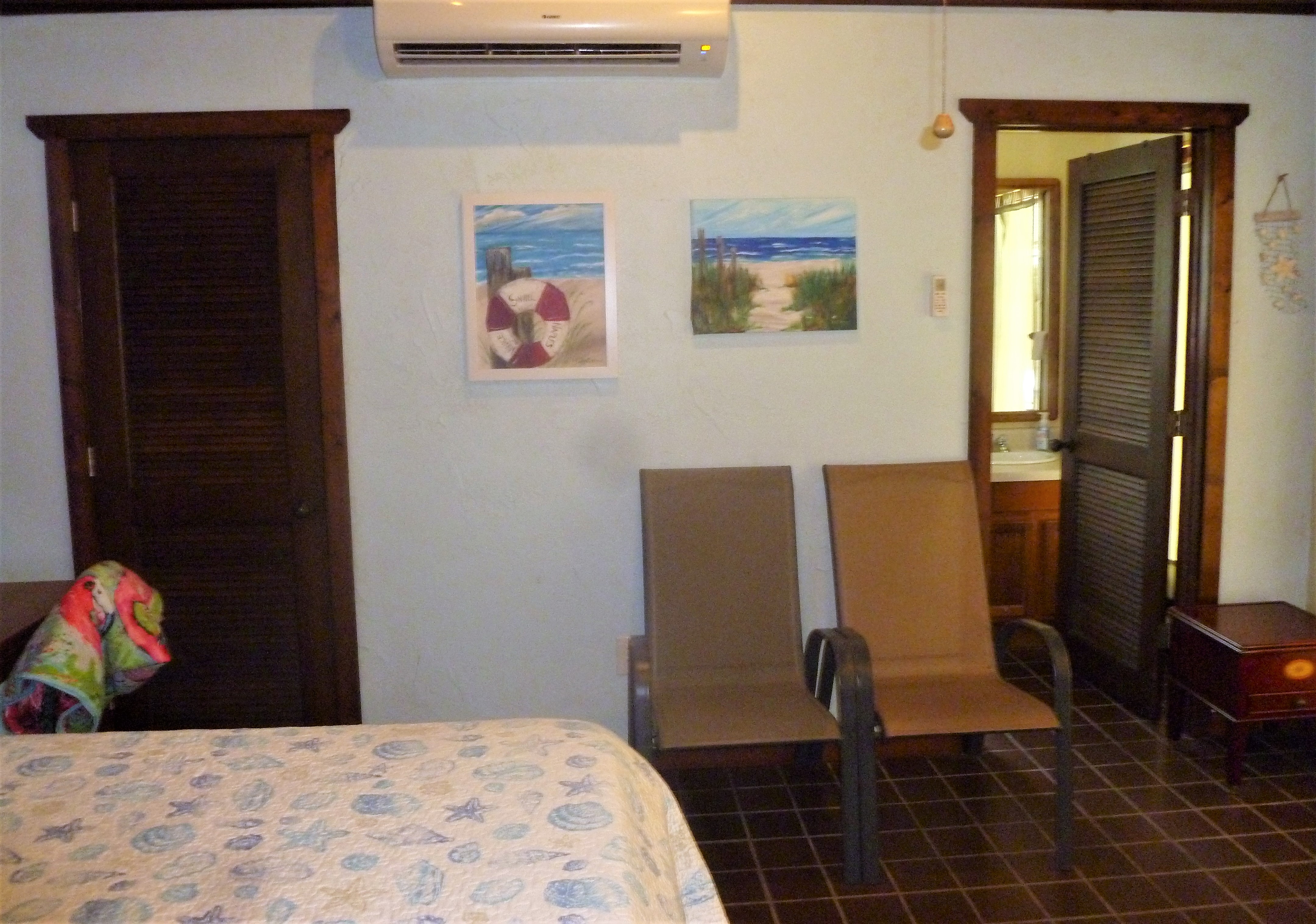
We have an ocean/beach/Florida Keys theme running through our Poolside Cabana, so the artwork and chatchkis reflect that. Some are my partners watercolors, over the bed is one by her favorite teacher – beach scenes. The chatchkis are things like shells, a stuffed mini manatee, ceramic fish, turtles, etc. Sea themed bed covers.
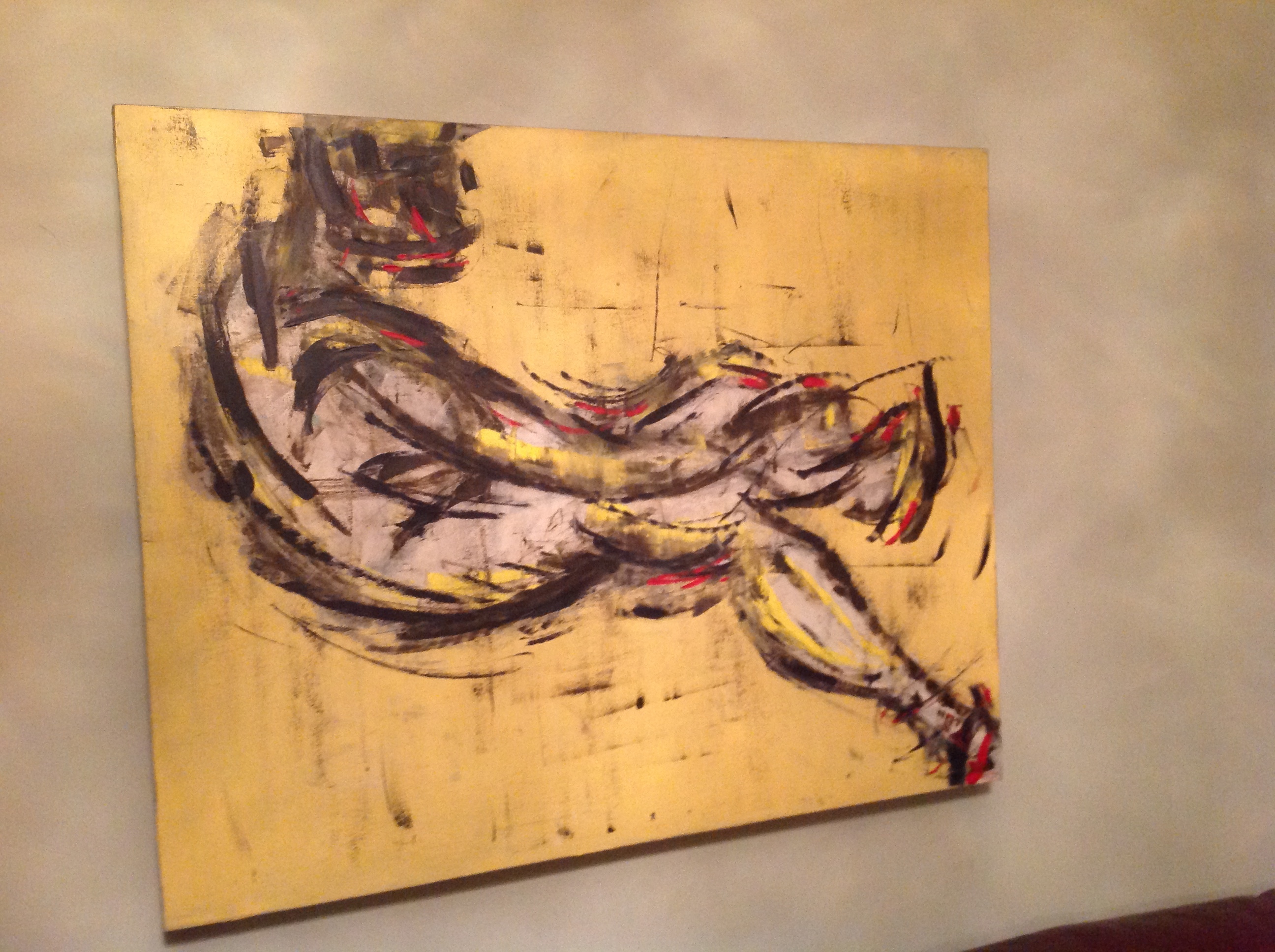
I got this one by a Georgian artist. Mr. Garden Gnome doesn’t like it very much. He thinks it could be too much for guests. He may have a point. So when guest are here, it’s going in the locked office.
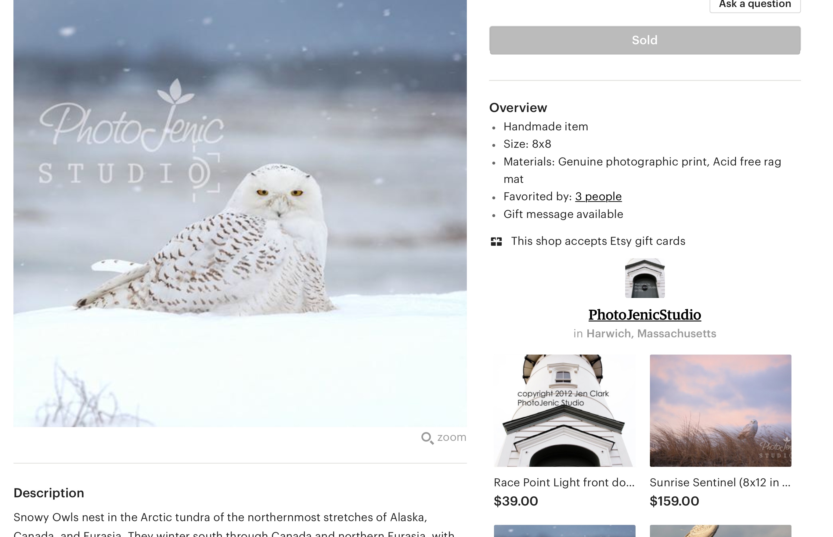
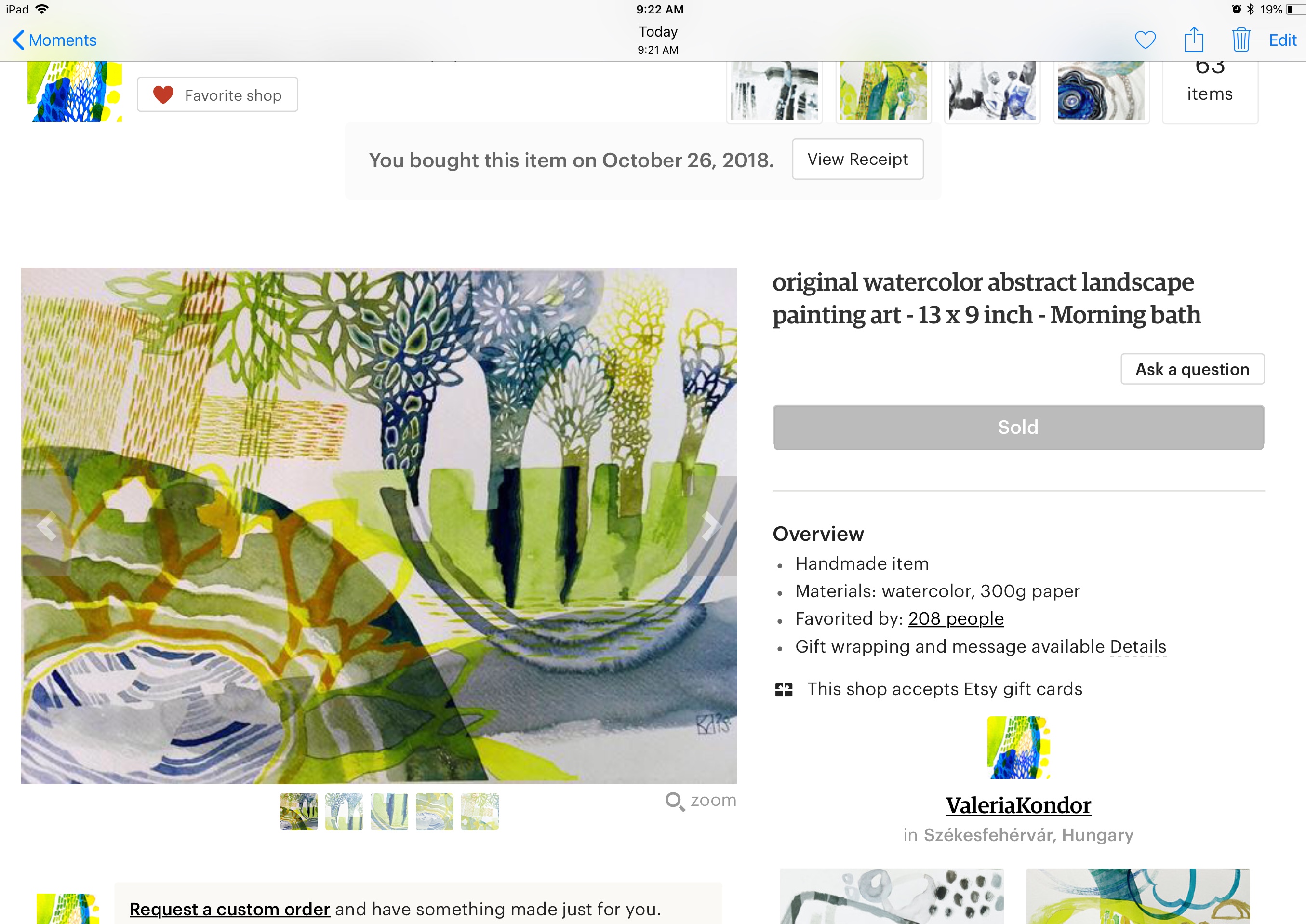
Both Saatchi and Etsy have a wide range of prices and ship all over the world. Getting the house ready for our fist guest who will be here in about a week has been a good excuse to finally put something on the bare walls!
For the 60s I’d look at Peter Blake or early David Hockney. I also have a bit of a thing for framed album covers from that era (easy and can be really cheap on ebay) but that’s just me.
My room is kind of a travel theme, all perfectly forgetable IMO. When one enters the room there are 4 El Paso photos that I paid a former student to take. Then there are two “discover El Paso” graphic prints, and some framed postcards. Also a reproduction 1922 Italy poster. A set of minature prayer type flags. I used to rotate in a trio of three posters that I have but now have those in my part of the house. It’s not even worth taking pictures of it all. For my market with an endless series of one nighters something kind of generic and nothing expensive seemed like the right choice.
But if one has a strong design for the listing then I think you should go with strong design choices. One can certainly attract a certain kind of guest by making certain aesthetic choices. Someone here has a San Francisco area listing that was very unique. Very dark and modern with great art. Not for everyone but if you didn’t like it you don’t book it.
I’ve been eyeing up several Mini Moderns patterns since seeing your post. And that is ALL I have been doing…(some truth to that…they are amazing and whimsical…lol!)
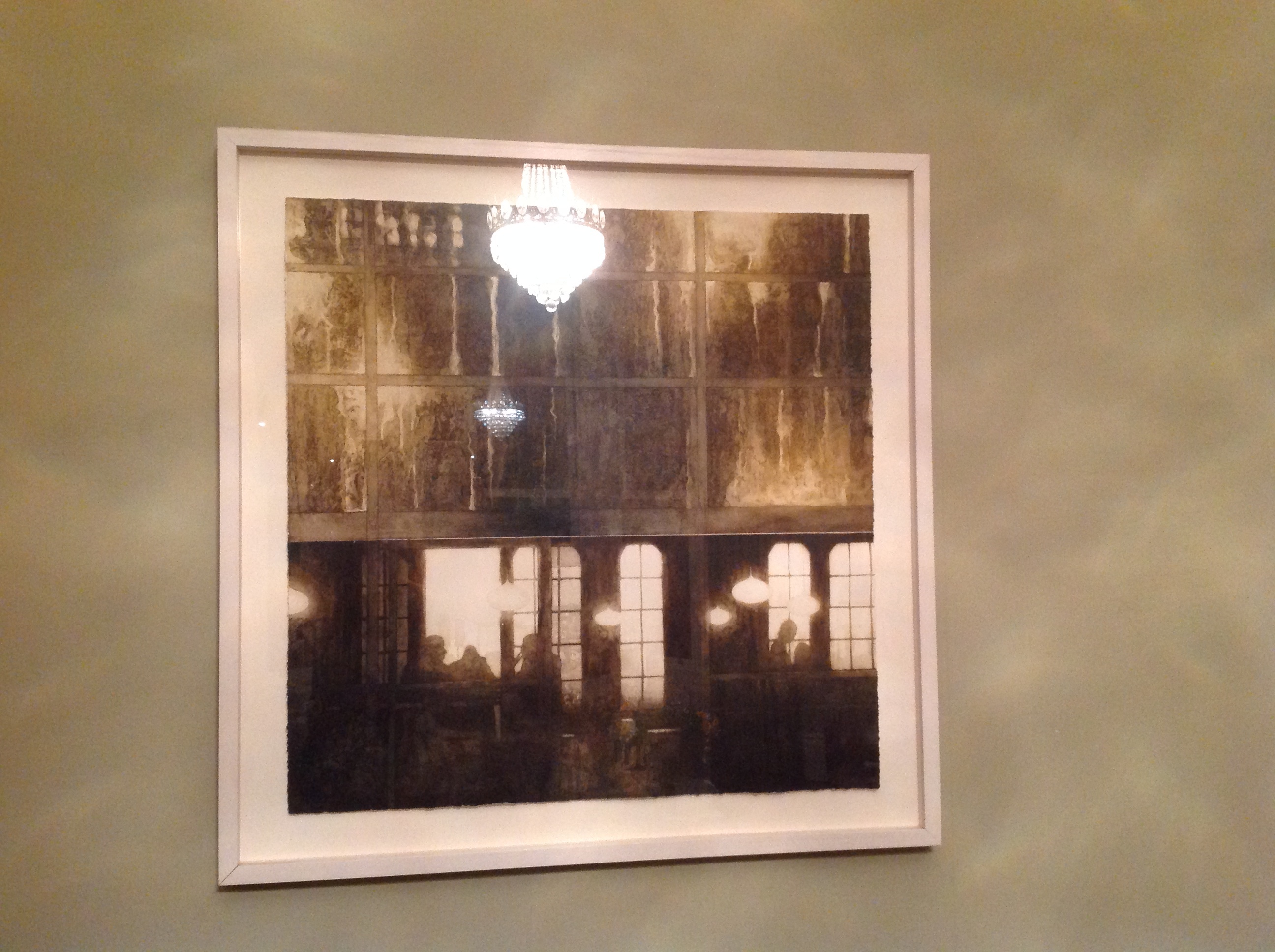
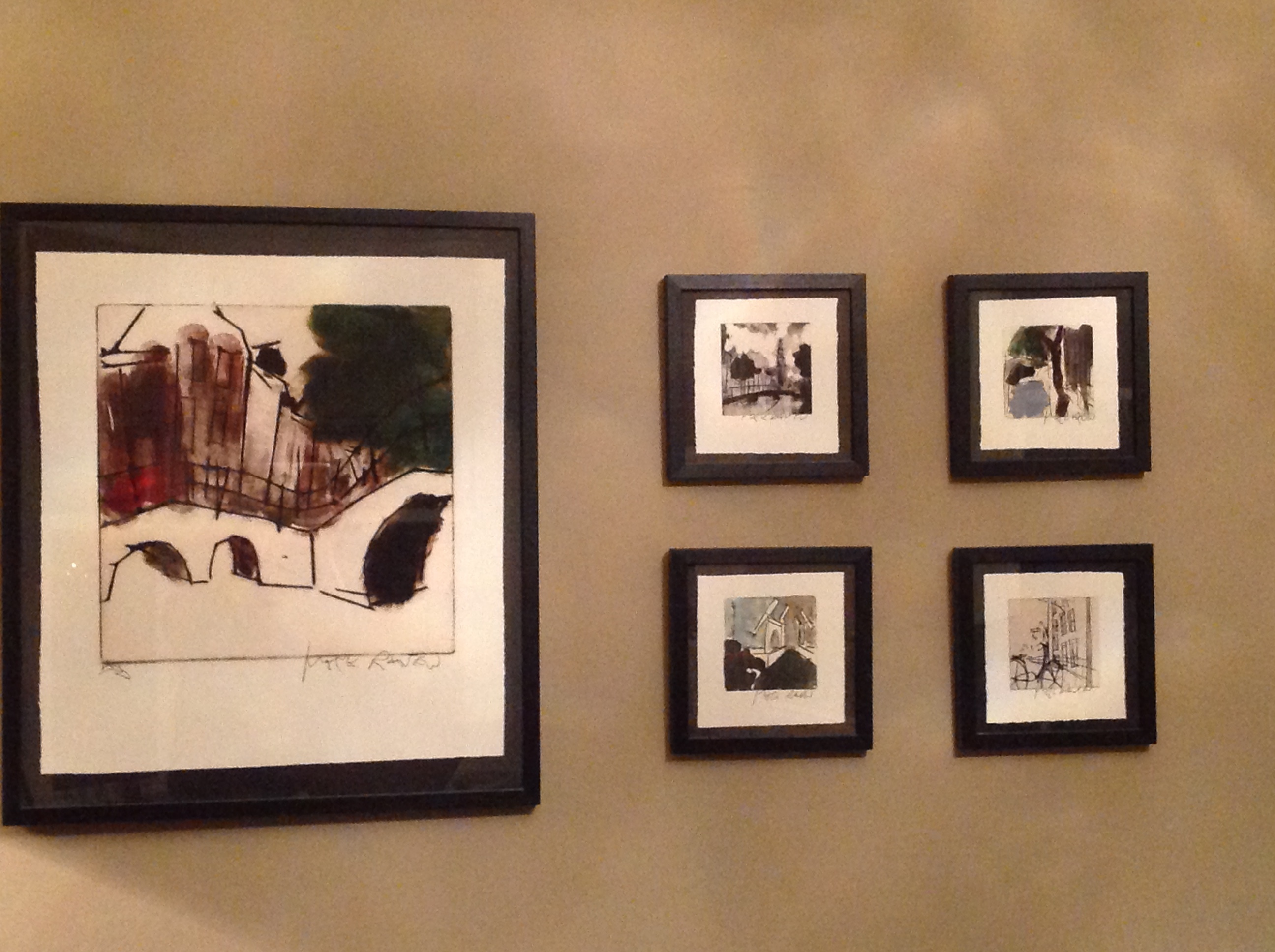
We just stayed in an Airbnb in the Boston area this past weekend. Both my husband and I commented on the fact that while the place was filled with “art,“ almost everything was far too small for the wall space that it occupied, which just made everything look somewhat sad. Don’t be afraid to fill up your space with larger pieces/multiples (odd numbers of items are more aesthetically pleasing than even numbers).
What I meant was that more than a few of my pieces would likely be popular just as someone in their 60s was being born. They may find it somewhat nostalgic but I fear that the more conservative of the bunch would find it a bit wacky or odd. All advice I’ve seen says to stay neutral so as not to offend or unsettle.
But then this is a group that saw the 70’s so what am I worried about?
I love the use of colour, Ken! People are always scared of colour. So many listings are “greige”. But then again you do have a year round pool and are in Florida, so you can do whatever you like!


 .
.