OK, I give in. What other colors should I add to differentiate rooms?

I’ve thought over what folks have said about my 3 br apt at

https://www.airbnb.com/rooms/50450189

and I’ve decided to paint at least the night stands, and probably eventually the bed frames.

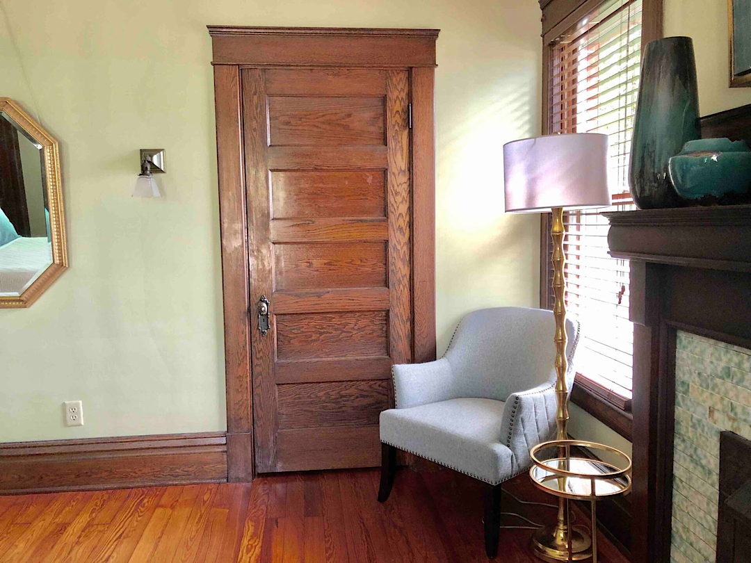
My experiment with staining them to match the woodwork didn’t work well because the trim is all old growth straight grain Douglas Fir, which is really reddish, and the IKEA furniture, which I bought unpainted, is pine which is much lighter in color and doesn’t absorb much of the stain.

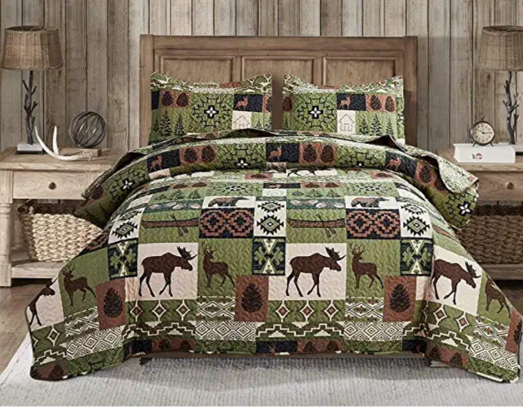
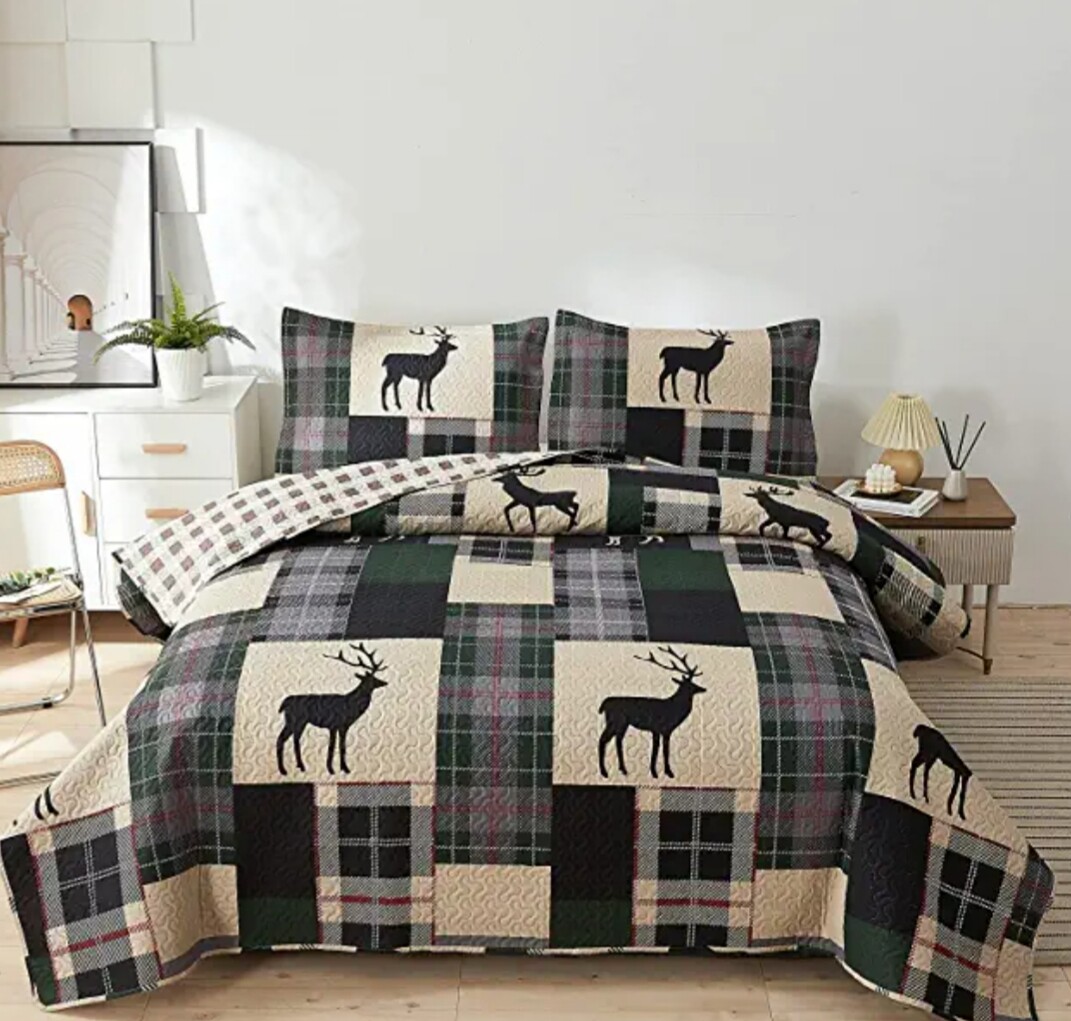
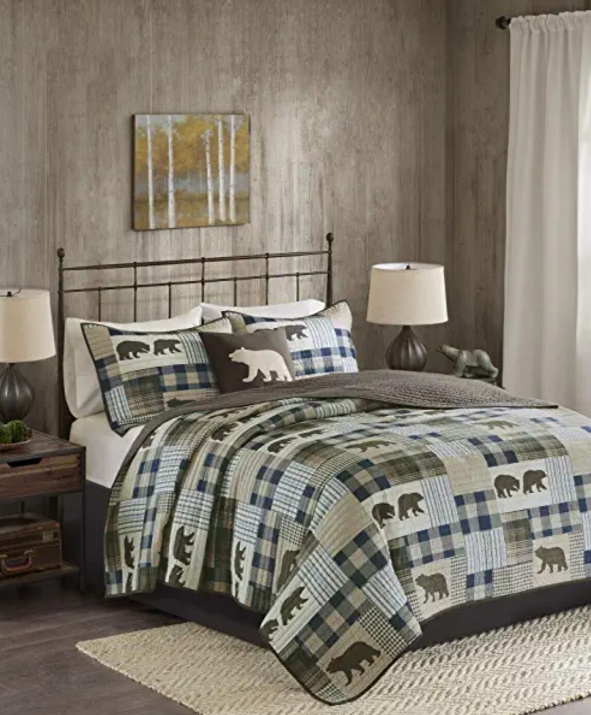
After testing Sherwin-Williams urethane enamel on a kitchen cabinet, I decided to use that on IKEA stuff, but what colors? I am NOT one of those folks that knows which colors work well together, and anyone I know who does is a professional designer that I can’t afford.

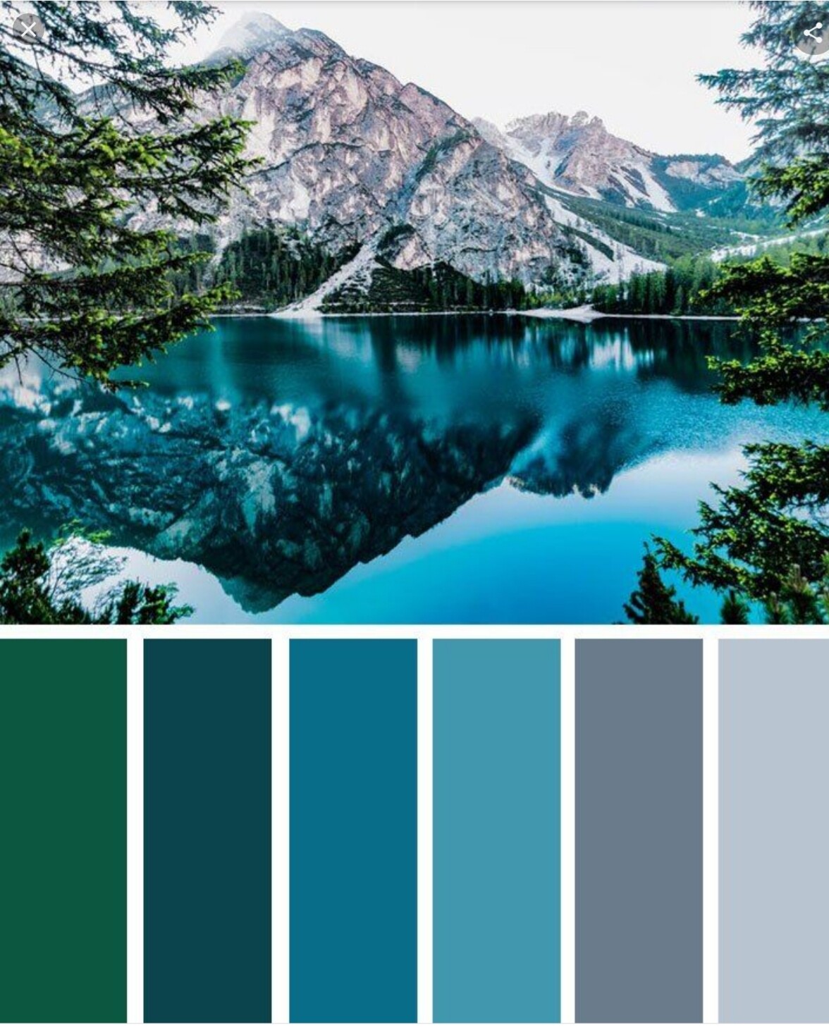
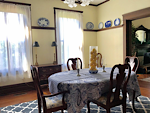
Please take a look at my pix. So far, these are the existing main colors in my decor:

  • Gray stained fir trim with reddish grain
  • Gold colored red oak flooring
  • Navy blue duvet covers and curtains
  • Neutral gray carpet
  • White walls (that gray was an experiment, and I’ll be changing them back to white)

I would like the accent colors for each room to be different enough that it’s obvious that it’s not the same as the other rooms, but I don’t want them to be overwhelming. I would prefer darker or more solid colors for furniture because scratches or marks aren’t as obvious. Since a satin finish is easiest to maintain, I need to account for the difference in apparent saturation between that and a glossy finish.

If you have a color idea, please go to

and click on “add a color” to pick the color, then send me the resulting color number or color name so I can find the right chip at the store to compare. I can take woodwork and flooring samples with me, along with a pillow sham that matches the duvet covers.

Thanks, friends, for your help. I look forward to your input.

2 Likes

6 Likes

Salmon or terracotta. Something like SW6621. But I think you should do the accent color different in each bedroom.

2 Likes

We do different duvet covers/bedspreads and different rugs in each room, might be easier (and less permanent) than painting furniture . I’m
not sure different colored side tables would make a big difference in pics at a glance since they have lamps on top and take up a small amount of visual space.

2 Likes

The bathroom pic is low quality. I’d retake that.

Beds need a throw and decorative cushions to bring it to life

3 nature pics? Do you need that much?

Overall, looks good. Top job.

1 Like

Honestly I don’t think going to all this trouble for people who can’t bother to read your listing makes sense. If you like your system, stick with it. You aren’t a new host. Your rooms haven’t had any trouble being booked in the past.

When I did student evaluations for my Holocaust Studies class, a third of the students would say I showed too many videos. Another third said all the videos were their favorite part. Another third didn’t comment. Ultimately I had to choose what worked best for me.

5 Likes

When you consider paint options, you may wish to checkout Beyond Paint

After cleaning, Paint directly over painted & stained surfaces.
Dries to touch fairly quickly. Fully cured /hardened in 30 days.
Can be tinted to different shades to contain up to 10% tint.
Can be used to paint almost any solid surface.

I bought silver metallic & white from the Lowe’s Home Improvement website—not sold in stores. Lowe’s will tint (I think at no charge) and if unopened they will accept returns.

This product sells out quickly. It took me 3 months to get the paint I wanted.

My friend used this to paint several accent pieces and she was very pleased. I plan to paint in September. After I finally received the paint, my rental season started booking so I postponed my project.

I painted my wood kitchen cabinets 3 years ago. I wish this product existed then. It would’ve saved me several days of prep and quite a bit of bending, stooping & back pain

1 Like

I understand the desire for lighter colors. Instead of white perhaps consider a pale gray?

The gray one shade lighter than pictured by @Ritz3 would give you the lighter look you want & be a fashionable trend color.

Nordling House, I was just shopping online and thought of you when I saw some adorable comforters . Instead of painting the bedrooms and furniture in order to differentiate the rooms, why not just do it with quilts or comforters? You can refer to the rooms as the moose room, caribou room and bear room : ) 20210625_155220|413x500

gb

7 Likes

I like to use color to differentiate the bedrooms too. But since the house was built in 1913, there is a lot of wood. It’s golden oak but has darkened considerably in over 100 years, So I use light colors on the walls.

There are basically 5 wall colors I use: a pale yellow, a buff, a sage green, a pale grayed aqua, and a greyish beige.

This room is the sage green, it’s probably the darkest color I use. If you have access to a Lowe’s store, this color is Valspar’s Homestead Resort Parlor Sage. It goes nicely with lots of dark wood so it might suit you.

3 Likes

I love sage green- it’s a really calming bedroom color.

The dining room is a yellow that contrasts nicely with dark blues and dark wood. The color is Valspar’s Jeykll Clubhouse Yellow.

image

That was the idea! As long as what’s different doesn’t have to be laundered and sorted to the correct room.

Nope. Never. Something more to wash AT EVERY ROOM TURN. Always end up hidden somewhere, like extra pillows, which I only do because it’s expected. 4 pillows per bed.

If I’m by myself, I want some clean place to put them, and the closets here have space, unlike many Airs where I have been a guest.

Guests want space, not clutter.

3 nature pics? Do you need that much?

This is Alaska. People come here to see wildlife. All the art is Alaska themed except for the 3 Stooges movie poster on the fridge advertising a “Three Star Hotel with 2 Star Soivice!”

4 Likes

Pretty color.

I’ll bet this is where the paint got its name. It’s difficult to see the correct colors in these pics

Pretty color. Scroll down for pic. Lots of wood. Same color theirs is shade darker like maybe they did an extra coat

I’m with you on that. I don’t understand putting stuff on the bed that never gets used, just put on and taken back off. As well as having to be washed. Those bed photos that have decorative pillows piled up halfway down the bed look utterly absurd to me.

Four pillows per bed for a 2 person bed, though, isn’t just expected, I always use 2 pillows myself. First to prop myself up when I read in bed (like every night) and then I like one pillow under my head and one on my head to sleep. I know that sounds weird, but it blocks out light and sound and puts me in the sleep “zone”. I have a special pillow for this that I even take travelling with me- it has to be floppy so I can sort of squish it around on my head with my eyes and ears covered and my nose and mouth uncovered.

Your nature pics are fine- I’m actually surprised you don’t have more, although some hosts overdo that.

1 Like

Yes, you have it exactly right. Lowe’s and Valspar teamed up with the National Trust for Historic Preservation and came up with the National Trust Property colors they were going to offer to the public. They are the colors used in the named properties and rooms. The grayed aqua I also use and mentioned earlier was a National Trust color called Carolina Inn Clubhouse Aqua. The buff color was Belle Grove Buff.

I think the arrangement may have ended. You can still get, for instance, the Carolina Inn Clubhouse Aqua, but it’s now called Flower Garden! Totally stupid name, IMO, because no flower I can call to mind is a grayed aqua color! If you tell Lowe’s the National Trust color name, they can look up the paint code and reproduce it—at least, the Lowe’s I go to can do that.

1 Like

Beautiful colors.

For a while Valspar & Behr were into food names.

My small condo is mostly Lemon sorbet with an asparagus green kitchen & I painted a faux tile backsplash in strawberry daiquiri.

My home & both my STRs are tea stain (gray with touch of green) & lemon sorbet. Much more subtle colors

2 Likes

I write down the formula for my paints, since they do change color names.

1 Like