Offtopic: Can you review my website?

You want us to nitpick, I love doing it, so here we go :yum:.

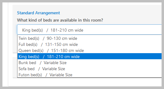
That’s what we do to avoid discussions about bed size. I agree with @AlexSJ on the bed sizes. (To me 1.50m isn’t even a queen.)

I’m on MAC, Safari and it shows properly. I like the overall look, but I don’t like the red banner in the middle (“The Woodsfort is open to…”) because I thought it was the end of the page and stopped scrolling down. Then I wondered where the images of the bedrooms were.
EDIT: I also hate the second red banner. I again thought it was the end of the page and didn’t scroll down to location :grin:. It may be something in my brain :sweat_smile: or maybe the banners are really counter intuitive.

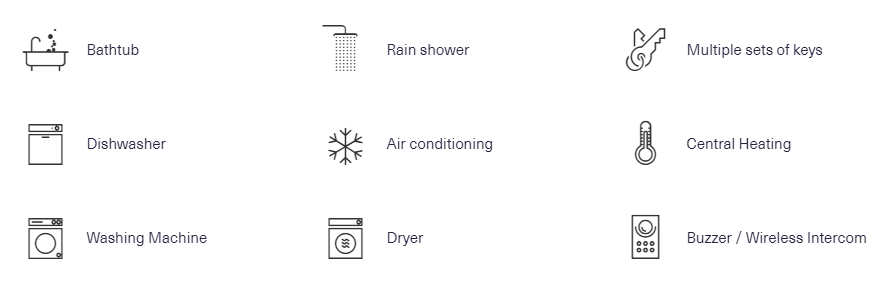
I also don’t like the “For your convenience” section. Although it’s easy to understand, it looks like an online shop and absolutely doesn’t reflect the luxury of the listing you are trying to rent out. Your whole website should reflect sophistication and elegance: The “online webshop” that you put at the bottom, does anything but that.

First show bedrooms, then show bathrooms.

Why does bedroom 4 have a sofa bed instead of regular bed? You already have two separate living rooms and a nice outdoor space.

You only have dining room seating for 8, but have bedrooms for 9. Wouldn’t it be an idea to change bedroom 5 into an office space? And put two separate beds (that can be joined) in one of the other rooms?
Will you put a limit of 8 guests or 9?

I like the knights of the round table outside, but it appears to be smallish for the amount of seats. And also, there are only 7 seats, I don’t know if guests dare to fuss over such a thing.

Dining area: If it’s really suitable for 8 people, maybe you should also show it when it’s set up for 8, maybe with table linen and everything.

Main living room: The column with the vertical frame on it. It’s a pity that the light is that close to the column. The shadow that is being shed doesn’t look great.

Sliding doors on bathrooms are not great because of acoustics.

Sorry if I sounded harsh in any moment. The place does look really stunning ! The website is ok, but lacks elegance and sophistication. I think with the place being so nice, with a better website (nicer, softer feel) you would be able to up your price.

I hope that you will give us some feedback in one or two years about your experiences in putting that kind of property on the STR market.

I don’t want to hijack the thread but I have to second this strongly, especially if it is a barn door style. Pocket doors seem to be okay. When I was remodeling my contractor asked if I wanted a barn door or regular door. Even though the space is small I said I don’t like the lack of privacy with a barn door. Then this summer I stayed in a nice hotel, modern and recently remodeled and they had barn doors on the bathroom. I was traveling with a good friend but not an intimate friend, and although we didn’t discuss it I’m sure we both would have been more comfortable with more privacy.

1 Like

I second making br 5 an office. Maybe have one of the sofas in one of the living rooms be a sofa bed (but a nice one) if you want to add additional sleeping space if you think you may need it.

2 Likes

Fear not, I think that was the problem as it looks fine now. (It still looks better on the phone and on Edge but never mind that). :slight_smile:

Maybe I had a typically South Floridian dodgy internet connection.

1 Like

You had me at Holland Park. My favourite London Park. Oh the dahlia garden in summer! Yeah and your place looks pretty damn good as well.

1 Like

It’s looking great :slight_smile:
Two things I’d add pretty soon. Firstly, I’d add a FAQ section for potential guests. To begin with you can imagine for yourself what questions you want to answer but after a few months you’ll soon know what people want to know - can I bring my dog? How far away is Heathrow? Do you offer discounts for longer stays? Is there a concierge locally? Etc.

Then have a log in section for guests. This makes potential guests realise that they too can be a member of the elite group who get access (sounds so daft but it works - people are aspirational). In that section you can give plenty of information that guests only need … and importantly capture their email addresses for your ‘Woodsford Newsletter’. Use your website to ‘educate’ your guests and solve problems before they start!

4 Likes

I think they are. I’ve now replaced these with something else which, is less so. I will also update the top menu so that the current section gets highlighted. That will act as a further indication that there is more content below.

I agree. I originally started based on the Airbnb Plus model (see here), but then found it to be too time-consuming without hiring a designer. Will get it to look more like Airbnb’s which adds life, yet in a slightly more elegant manner.

I wish I could. But if you look at the menu/sections, it goes “Living Space” and then “Bedrooms” and each one has its own section. I can’t glorify toilets with their own section on par with living space and bedrooms. So they either go with living space or bedrooms. Only solution I can come up with is to put the bedrooms before living space, but I feel that the living space should come first as it is far more impressive than the bedrooms.

Current budget constraints. Will be replacing it ASAP.

Yeah. Only problem is that too much elegance and sophistication puts off everyday people with bigger budgets who feel terrified by the place.

Will do ASAP. Thanks.

Absolutely! This is coming up next. First step is to market the website to relocation agents, letting agents and corporates/hospitals with local presence. Then I’ll get on to doing the Welcome Guide as a logged-in section. Thanks.

Has anyone here seen good results with this? As a marketer, I understand newsletters to play the role of lead-capturing (if they are compelling enough) and then lead-nurturing (by way of constant contact). As a potential guest searching for a vacation rental for a specific vacation, jumping from option to option, I’d have no interest in getting on to anyone’s list. Or am I misunderstanding?

Thanks again to everyone for your feedback.

It’s definitely less ‘bottom of the page’ feel with your adjustment, but keep working on it.

A serie of two-tone app-like logo’s would be great. I don’t know how to explain, but a graphic designs instead of the photo’s you have right now.

In the sense that they are a ‘private’ space, bathrooms definitely should go with bedrooms and not with living space.

Mmmmhhh, probably if you overdo it. But think about the experience you already want to communicate trough your website. I am normally a very minimalist / clean / straightforward person, but I do have the feeling that in this case, the website itself could show a bit more character.

This is how they do it on the Plum Guide:

Is that what you mean?

Yeah. Whilst figuring out how to design the site, I stumbled across a template for a modern/minimalist house. The shades were darker though, which gave an uber-professional feeling which I felt may be over the top because the location is more family-oriented. I’ll try dig it up again and see if I can take anything away from it.

Yes, that is very similar to what I mean ! You could still play with the feel of the graphics, maybe make them a bit bigger. If I find another example I will send it to you.

1 Like

Okay, I’ve replaced the images with icons.

Please take another look at The Woodsford and let me know what you think.

Also, any thoughts on how/where I can use this…

Perhaps I just use the upper half? But where? Maybe a part of the calls-to-action?

The new amenities icons are way better!

No, I don’t capture the email addresses of potential guests - only guests who have stayed and who I’d like to return (which isn’t absolutely every one).

I was being a bit erroneous by saying ‘newsletter’. I don’t mean one of those boring things that land in your email box that are deleted without even being seen :slight_smile:

Quite often just a couple of times a year is a good enough time to keep in touch with former guests but I do think it’s important to remind them about your place and that you’d love to see them again. After all, when you have repeat guests you’re both getting the devil you know.

I’d never contact guests by email unless I’ve got anything to tell them (which is where a lot of people who run email newsletters go wrong) but genuine news is different.

Definitely! We aren’t doing it currently because we’re usually fully booked with a good mix of new and repeat guests but the email contact helped us turn one-time guests into repeat visitors. Now, they think of our rentals as ‘their place’. And hosting them is always so much easier than unknown first timers.

1 Like

Yes. You’re absolutely right. I do need to put a system in place to keep in touch with old guests. Thanks for that.

1 Like

Well … I kind of have the Queen at 1.57, but did not want to be overly picky about a few cm … anyways … just to have it somewhere … following image shows what options booking.com gave me:

2018%20Bedsizes%20acc%20Booking

So … POOF …sorry Fahed, but your bed just turned from Super Size King to Full …

1 Like

I don’t understand. It is 210cm wide which is the upper end of king on the booking.com screenshot.

I like the flow of your website and found it easy to use on my Samsung phone. The information and description makes me want to stay - you captured the essence of an experience. Fahed what font did you use as it’s very easy to read no matter what point size?

1 Like

Thanks. The body is Open Sans and the headings are Roboto.

1 Like