This forum is dedicated to connecting hosts with other hosts. Sign up to get the latest updates and news just for AirBnb hosts! Note that we are not affiliated with Airbnb - we are just passionate hosts!
I’ve just published version 0.1 of my property’s website and I’m hoping I can feedback from the many kind souls that frequent this forum.
I want the site to be as perfect as possible so that, when I reach out to relocation agents, corporates, hospitals etc. they are thoroughly impressed. I know it’s a lot to ask for, but please be as thorough as you can.
Many thanks in advance.
Fahed
p.s. Please ignore the enquiry form for now as I’m yet to give it any attention.
p.p.s. I have a virtual tour and video tour on their way, but will go live before they’re done.
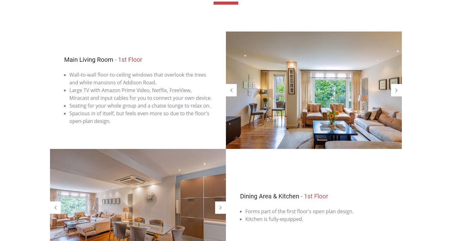
Spacious in of itself, but feels even more so due to the floor’s open-plan design.
Should be in and of itself; on the other hand I’d just say something simple like “Spacious, open-plan design.”
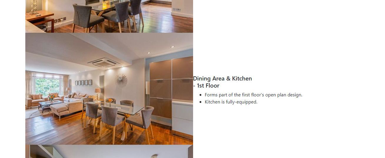
Dining Area & Kitchen - 1st Floor
Forms part of the first floor’s open plan design.
That’s repetive and doesn’t give any key information. (First floor, first floor) How about telling me how many can sit and eat there? I rented a 5 bed, 5 bath house and it had dining room seating for 10 plus counter seating in or near the kitchen for another 8. What is the proximity of the “second dining space” to the rest of the dining space? I’d give more attention to pictures of the kitchen.
I don’t see any pictures of bathrooms. I don’t rent places that won’t show me the bathroom in advance.
Regarding the bathrooms, 3 are Ensuite and are included in the pictures of the bedrooms. Was it not clear enough that bedrooms 1-3 had multiple photos?
As for the guest toilet and family bathroom, I couldn’t find a suitable place to put them. Where do you think I should put them?
But did you see them the first time round? I could put little magnifying glasses on the bottom corner of the photos to show they are clickable as clocking on them opens up a Slideshow.
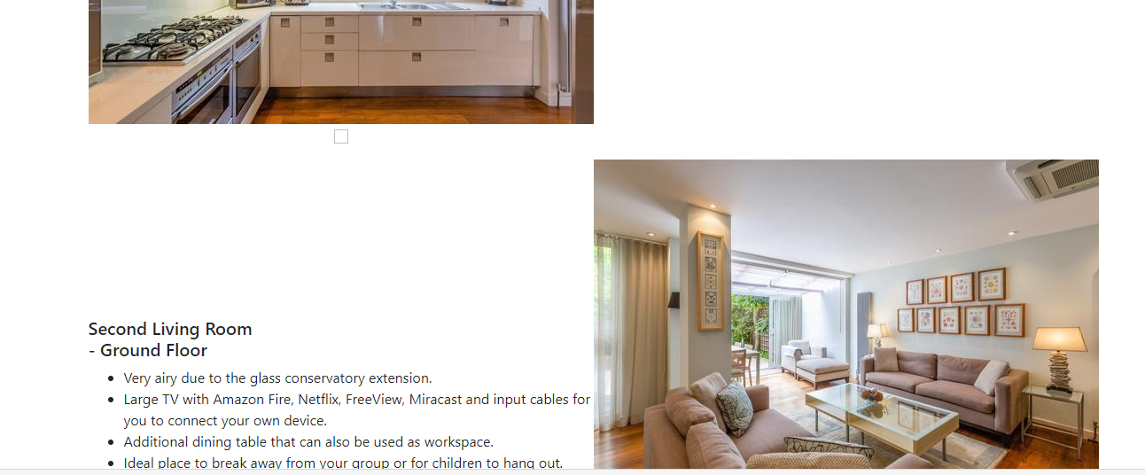
No, I didn’t. Honestly just a quick scroll down the page. I saw pictures of a park arrayed across the bottom of a page, I think in my brain I was expecting the pictures in a different place. But the arrows are fine, not too hard to see. As long as the bathroom pics are there somewhere, they will find them. Are there pics of the 2 bathrooms that aren’t ensuite? I also didn’t see the additional pics of living spaces the first time. There are the additional ones of the kitchen I see now.
I do have pics, I just couldn’t find a suitable place to put them. Maybe I make a 5th section in Living Space called bathrooms where I put all 5 bathrooms. I’ll still keep the Ensuite ones with the bedroom pics as well. What do you think?
Just checked it on Microsoft Edge and it looks great there too. The photographs alternate sides, the text doesn’t run into them and there are pleasant red highlights that I don’t see using Chrome.