This forum is dedicated to connecting hosts with other hosts. Sign up to get the latest updates and news just for AirBnb hosts! Note that we are not affiliated with Airbnb - we are just passionate hosts!
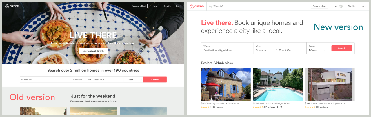
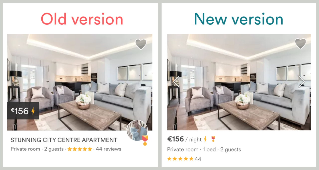
I really dislike that they removed the titles! That helps people sort through listings easier!
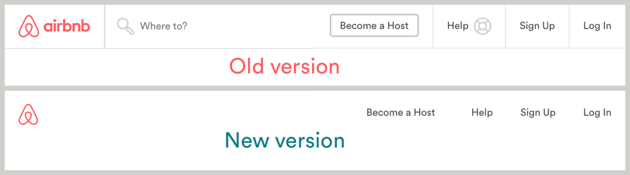
It does look like booking.com now. Don’t we have enough instant booking sites?
Why on earth does this company want to kill the goose that laid the golden egg!? Their original appeal and brand was to offer listings from hosts who shared their homes. Not be like impersonal sites where the host is not even in the picture.
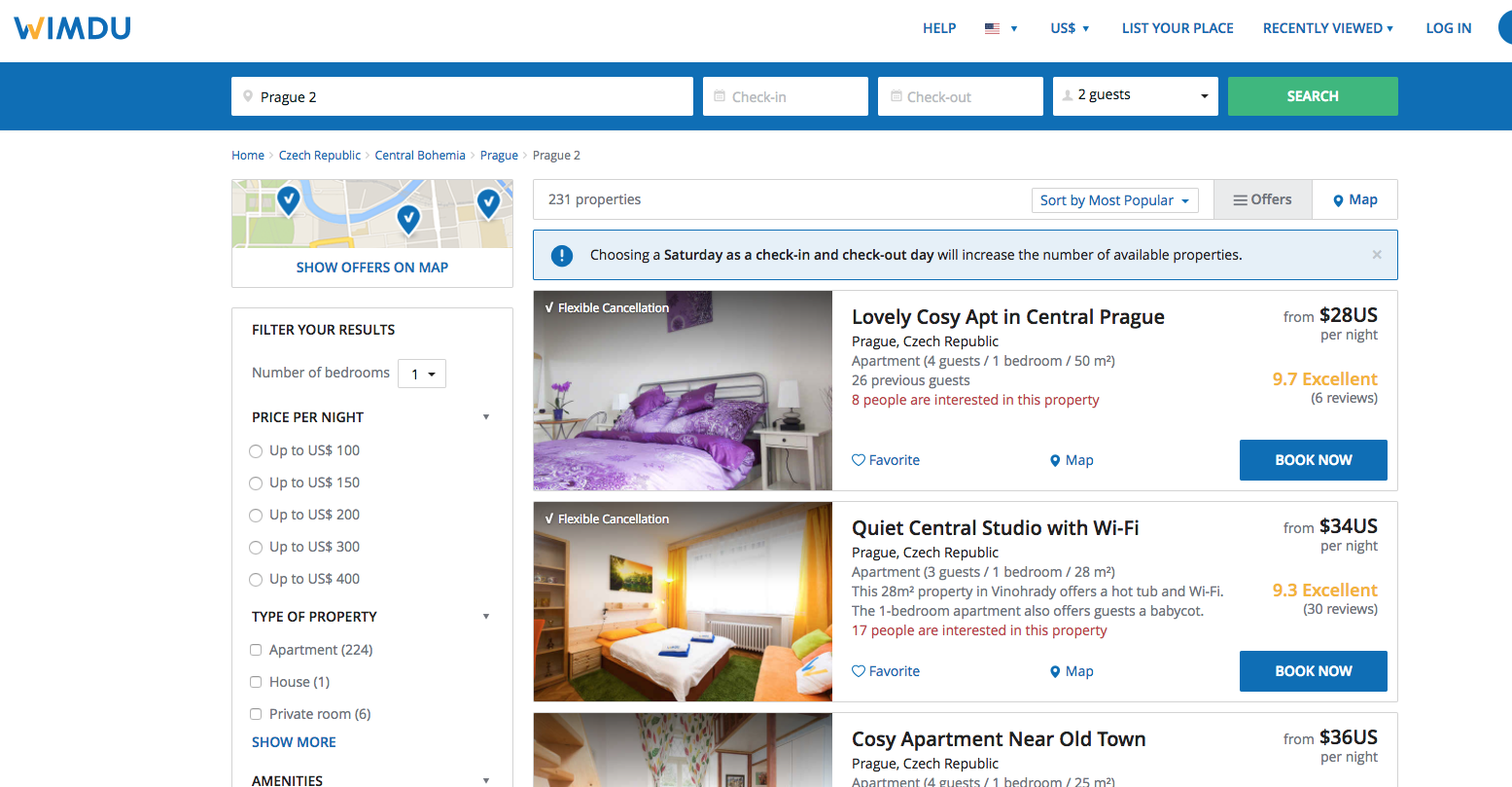
Even Wimdu kept the titles! (Although they have flexible cancellation called out.) Prices are misleading because they don’t include all the fees… which are more than Air’s for the guest.
I actually like that they have removed the titles on the search page. I guess that this page has a lot of information going on (pictures, price, reviews, the map, etc) that there was a need to clean it up a bit.
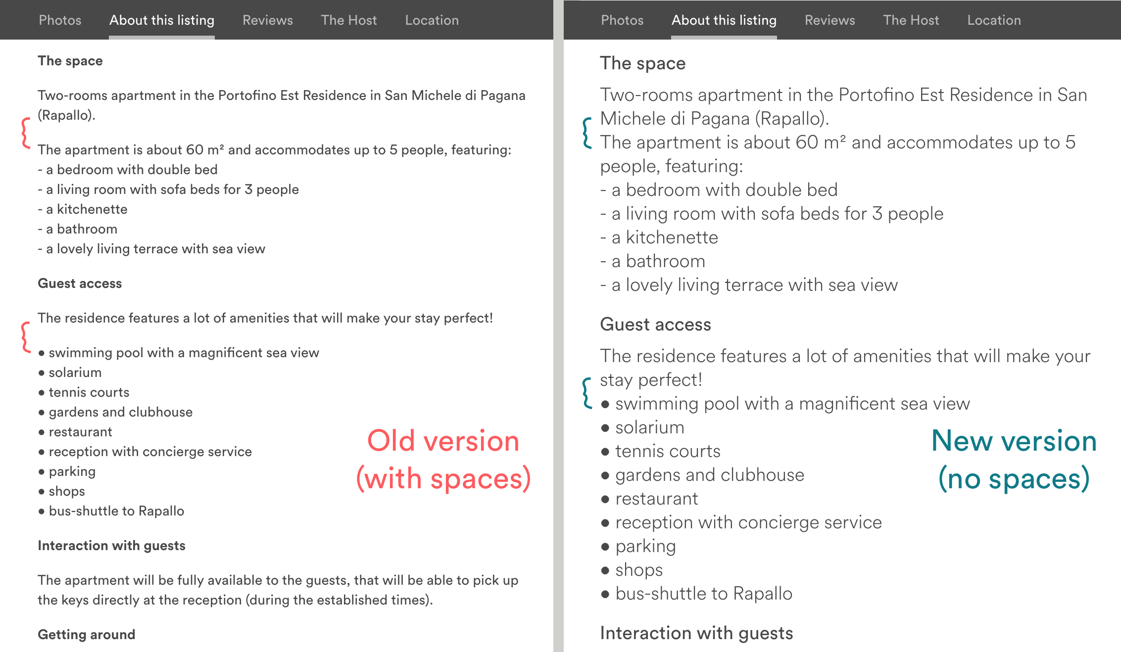
I don’t like the new font size. VERY BIG!
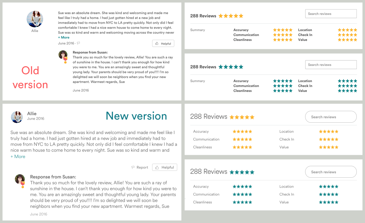
I don’t know if anyone else noted this but they also “cleaned”" the blank lines between paragraphs. I like to use blank lines to give the reader a pause and make the text more easy to read it. Now I have a bulk of text that doesn’t seem very pleasant to my eyes.
Not sure if we are talking about the same thing but the return character just breaks the flow of text to start a new line. However, if you try to add a return character in a blank line the “new version” wipes it out. To create a blank line I had to insert a single whitespace character in a new line. Maybe you are talking about something else.
I get what you’re saying. But how do you make a white space? I suppose you put any character and then select white as the color. I never use the tool bar I’m now noticing just above the text I’m typing
That’s exactly the problem I see for the font. It will definitely help some people (especially older demographics), while it could occupy too much space for others.
I personally always zoomed out my browser to 90% when looking at Airbnb… with this change, I’ll have to add even more zoom out!
The new big font size also throws many break lines in the page as the text doesn’t fit in a single line (much more widow and orphan characters than before).