This forum is dedicated to connecting hosts with other hosts. Sign up to get the latest updates and news just for AirBnb hosts! Note that we are not affiliated with Airbnb - we are just passionate hosts!
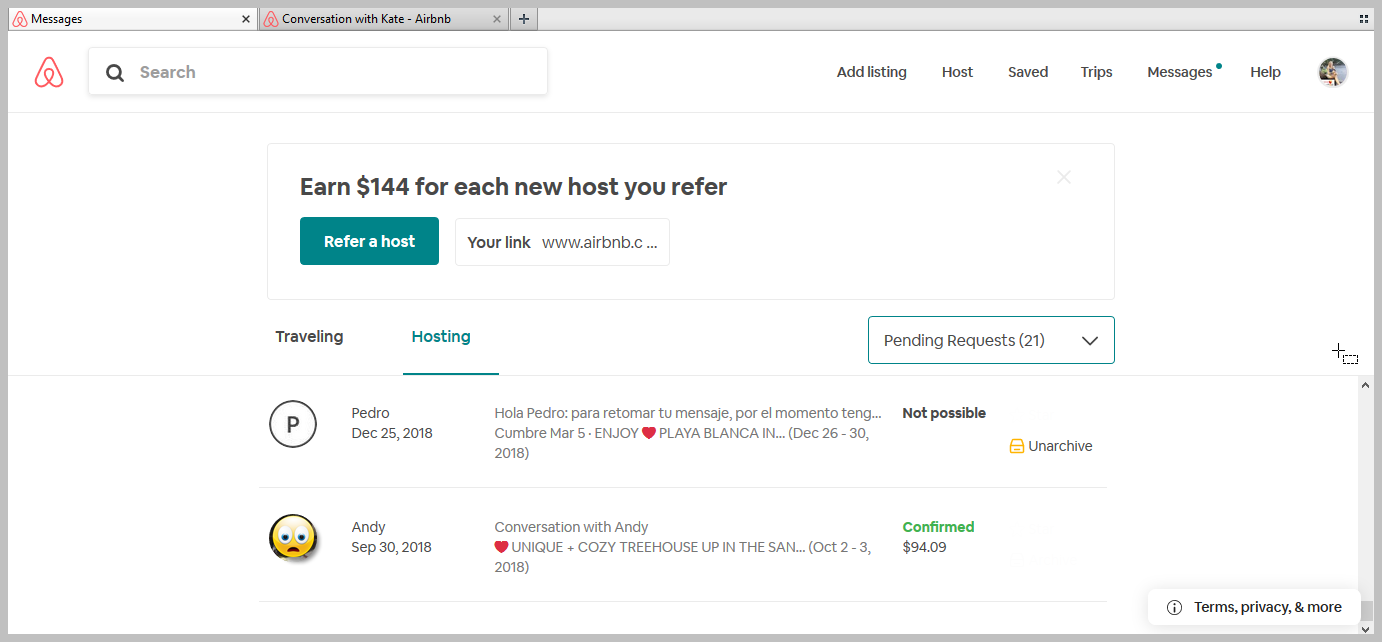
How stupid is this? Opened up the inbox on the laptop in my favorite browser and the “Refer a new host” ad takes up more space than they leave for the actual inbox messages. I get to see a list of 2 or 3 messages … So very stupid. No very user friendly at all …
Just for giggles, I see 21 pending requests and I filter to take a closer look. Most have long been archived away from sight … I mean really: they are from 2018 or 2019. Wedged in there … a confirmed reservation from 2018 …
You can simply close the referral banner by clicked the “x” on in top right hand corner. It shouldn’t reappear for a while. Maybe even as long as fifteen minutes.