This forum is dedicated to connecting hosts with other hosts. Sign up to get the latest updates and news just for AirBnb hosts! Note that we are not affiliated with Airbnb - we are just passionate hosts!
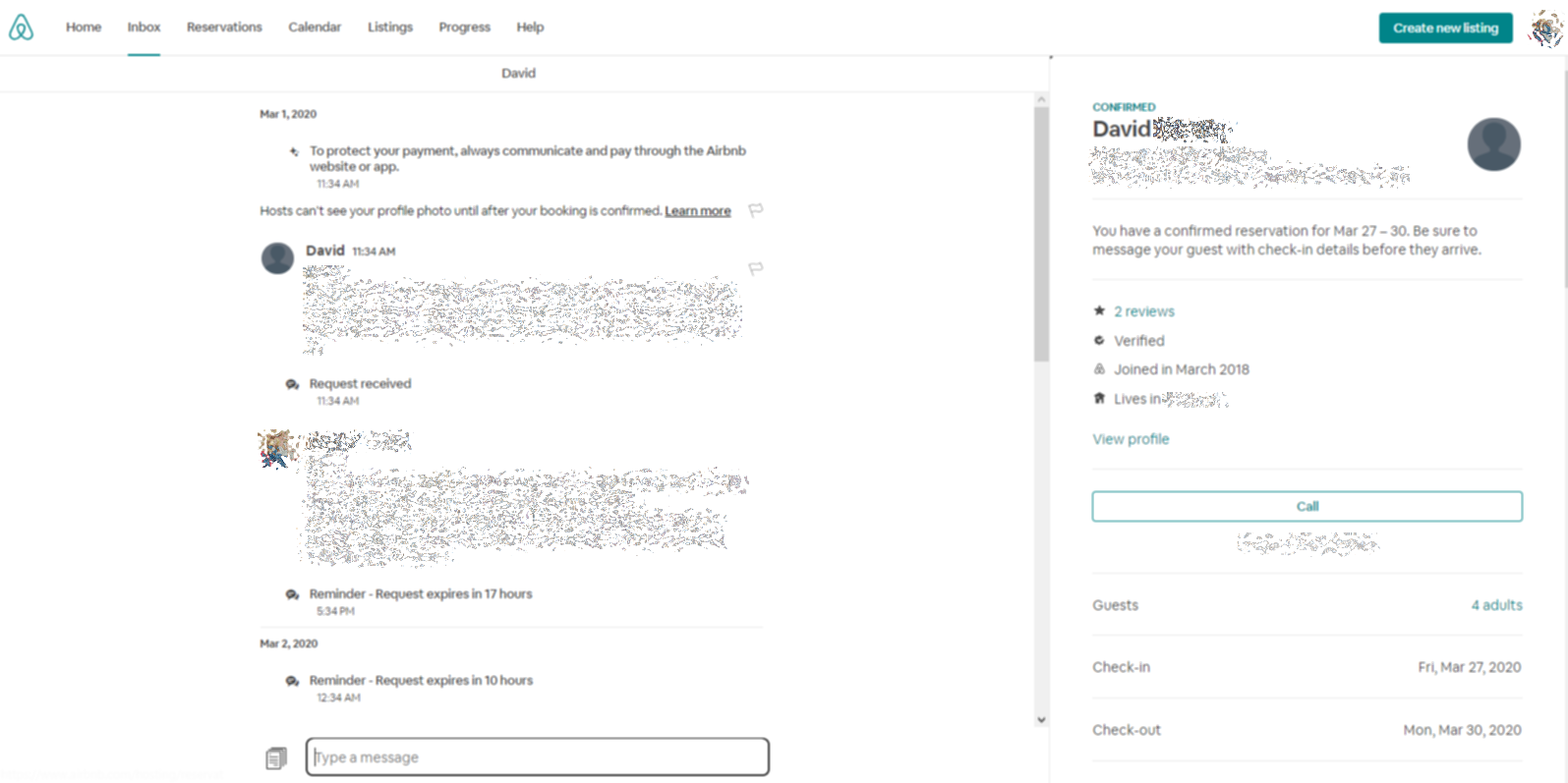
This is on the website, not on the app:
–The thread with the guest is on the left. The guest info is on the right.
–The newest message is now at the bottom
–You have a 1 line high box to type in. Once you get to 6 lines of text it gives you a scroll bar.
I really didn’t like the last interface change. This one IMO is horrid! I don’t mind the left/right change, but flipping the order of the messages to make me scroll, and not having a text box that grows as I type will be a huge change for me. At the last change they claimed they were making the website more like the app. Now I wonder what they are doing.
OMG, they just can’t stop “fixing” things that work perfectly fine, while completely ignoring all the constant glitches. Like all hosts have to do with their time is learn to work with a new layout. And they seem to be hugely enamored of clicking and scrolling, the more the better.
Maybe you’re one of the lucky guinea pigs they try out a new “experiment” on. Don’t have any new reservations, but will post if I get the change as well.