I agree with some of the of the other comments, definitely might have something to do with the photos… even the main photo of the building vs the bed, I’m much more drawn to the building because it’s a great picture…
Yes, the camera angles are a bit odd, and the living room, with brown couch and darker walls is not as appealing. I know at your price-point you don’t want to invest in a total re-do, but maybe just make it a nice, bright white. White looks clean, cool, and inviting. And change the angles of the photos. I like the green in the room, but the angle of the photo makes the room look dark and small.
A little paint, a few new photos…let us know what happens!!
@anon67190644, Susan, yes, perhaps I need to reconsider the dining area – while it can’t be seen clearly in apartment B, there is a long table and a sitting bench abutting the kitchen counter.
@MsJTherrien , Jenelle, I got feedback that nobody cares about the building and I should replace it with a photo of the interior of the apartment, so a few days ago I changed photos; before then the photo was of the front of the building…
I agree - if you could cover that orange, and put in table and chairs - and make a charming photo of it - eating is so, so integral to family & community - I know I want to see where we are going to sit as a family and eat - and play games.
@dcmooney, Nancy, what orange? I don’t think there is anything orange…and perhaps you and others are right about a proper table and chairs…
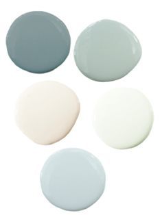
Definitely paint would made a huge difference…and paint is cheap especially if you’re the one doing the labour. What about light and airy colours like these? I think @Maggieroni said she was an interior decorator maybe she has some ideas for you.

I’m neutral - it looks kind of like hotel art - I just think, once you change the orange for something more ‘miami’ you’ll know if that picture fits. It doesn’t really ‘go’ with the couch. Are you able to do the painting yourself?
I like the pink or white - says ‘beach’ and ‘waterfront’ to me. You can add color with a new picture or two - something from TJ Maxx or Marshalls that won’t cost you a bunch. Maybe a pretty framed mirror, to reflect the light, give a sense of depth to the narrow room.
I just love this forum… you guys are amazing. Ya’ll are helping me make travel plans for my trip to the UK, helping @MissMiami redecorate… it’s really special.
@dcmooney, thank you, I will do a little shopping and get a couple of pillows for the brown sofa, get a small table and chairs, consider painting the place, and some of the great suggestions all of you offered. Thank you soooooo much for the generous guidance!!!
Definitely don’t go by my opinion, lol, I never travel and am drawn to sparkly things like a child! ![]() I also like the other suggestions on here about a few new bits of color!
I also like the other suggestions on here about a few new bits of color!
Just one last thought - what does the pool look like at sunrise or sunset? Are there fewer people around at those times? It would be great if you could get a more scenic shot of it - it’s an amenity that not everyone can offer. Set the stage of a glorious pool day…a lounger with a colourful cocktail beside it, crisp white towels, a pair of sunglasses, a book, ahhhhhh!
Sorry - didn’t see the question earlier - in the living room - looks orange to me - perhaps more brown - gold - I don’t know. I just think something lighter would make it look fresh.
@SuiteRetreat, actually, a lot of weddings are held by the pool, it’s beautiful. Surprisingly, not a single guest seems to be interested in the pool or other amenities…rather odd…
Ok, I am coming late to this party since so many other posters have made great recommendations. I agree with everyone else about the colors, but wanted to add a few thoughts to that.
Right now blues, grays, shades of brown / neutral and bold geometric patterns are in style. Current metal colors are brushed nickels (starting to get old) and chrome (newer). The blue colors SuiteRetreat showed were spot on trend. This has a lot of similarities with the 80’s styles (although then the metal color was bright brass). I notice that the side lamps in the bedroom are some kind of nickel color so it looks fresh. The rooms are mostly the brown / neutral in shades. I had a Pier 1 catalog this spring that had pages of similar looks to your room. (and I drooled over them!)
Apartment B is the style that was on trend right before this one - earthy tones with a pop of red. That stuff looks great but our eyes get trained to identify with whatever is currently in style and reject what has become dated. Think about how you feel when you see something that is period 60’s or 70’s - the first reaction is UGH! But yet that avocado green refrigerator was the envy of all the neighbors.
People don’t even realize how much they react to styling. Most of us are not interior designers and don’t follow trends. But we gravitate to the things that “fit” with current images.
@Artemis, thank you for your insightful feedback, I will have to really consider my choices for greatest mass appeal…
