This forum is dedicated to connecting hosts with other hosts. Sign up to get the latest updates and news just for AirBnb hosts! Note that we are not affiliated with Airbnb - we are just passionate hosts!
Hi,
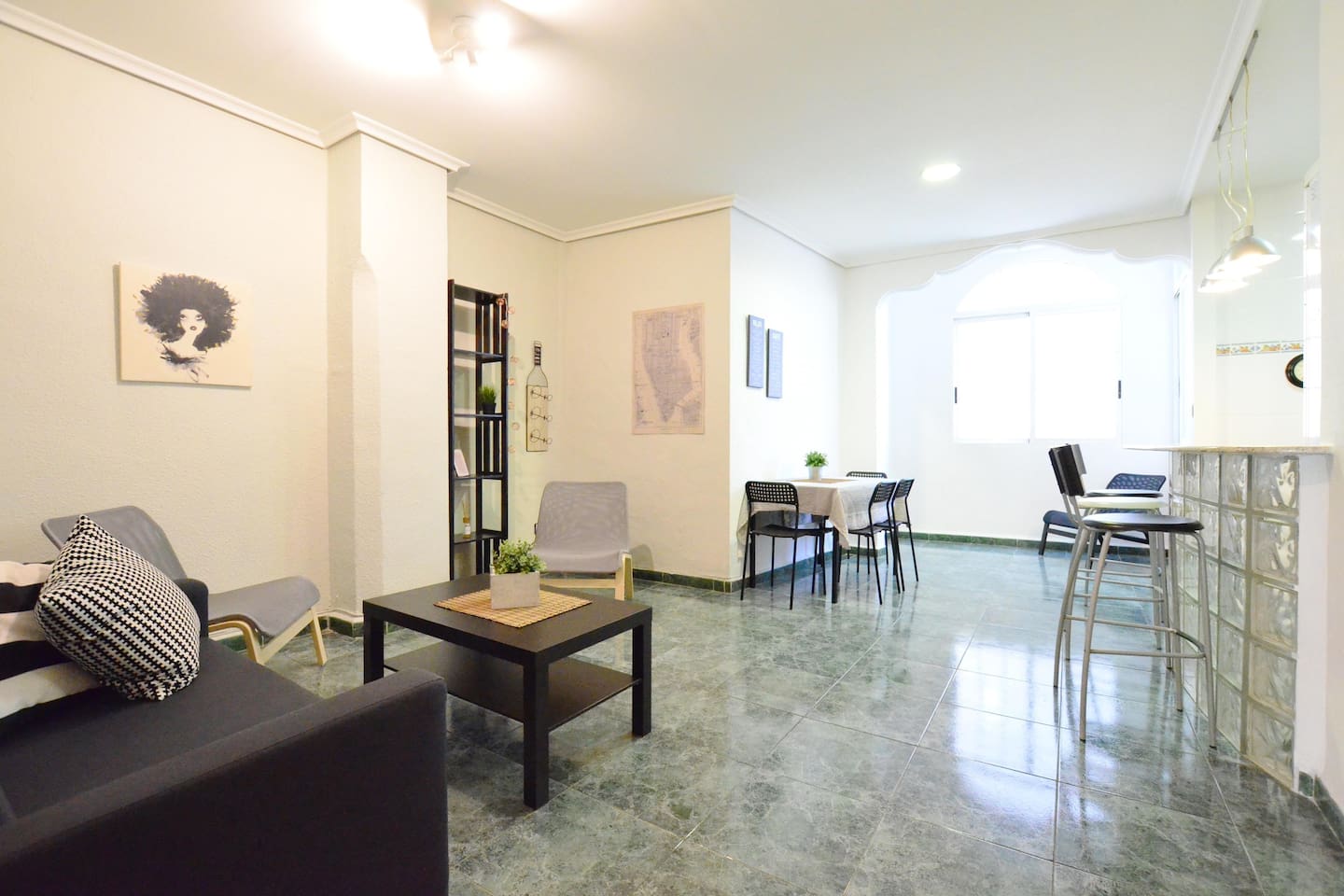
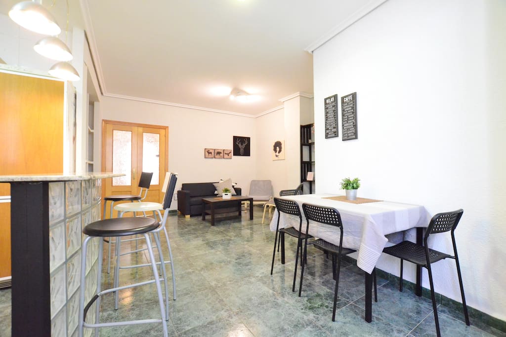
I made some new photos of my apartment and wanted to ask which photo do you like better and which one should I set as the main featured image. Needless to say, this image has huge impact on potential reservations so I want to do a but of user testing before I set one of them online. It is the same room just from different angle.
I actually like the second one better. The first one, the focus is on lots of tile flooring, while the second one has less of that. I think, however, you might do better overall focusing on one area at a time.
I stayed in Valencia just last year in the most disgusting flat I have ever rented. You are WAY underpriced if your $27 is really your price, but now I see that this is just a teaser price for the way off season. I would recommend that you add a personal profile as well.
Really nice looking apartment. Just one minor suggestion - your photo captions are in Spanish (I think). Why not add them in English alongside? Maybe separated by a /.
Thanks! Actually they were exactly like that, with Spanish + English before, but now I uploaded these new photos and made them only Spanish, I will add English ASAP.
I like photo A better. And I would consider some colour somewhere. (In the bedrooms maybe on the ceiling .)
But whatever you do: Raise your price ! It looks way too good for too little money. People will not trust the situation and won’t book.
I am now set at €40 per night for 2 + €35 cleaning fee which seems kind of average for Valencia. In July August it goes up a bit for holiday season. The €25 shown is only low season price (winter). There is quite a lot of competition, so although I would of course love to earn more the competition keeps the price low, around €50 everything included seems to be the standard…
I agree that from the photos it may look like that, but in the reality it’s way more colourful, it is just effect of increased brightness on these photos. I like white, clean apartments, that’s why I made this one simple too. But of course I could paint a wall or add something more colourful, thanks for the suggestion.
Wow! Awesome place. In photo B, the chairs look a little uncomfortable. Can you add seating pads to them? There are some interior designers here who suggest you pop with some color. That would be a good place to do it.


 .)
.)
